

focus on
At the heart of this project
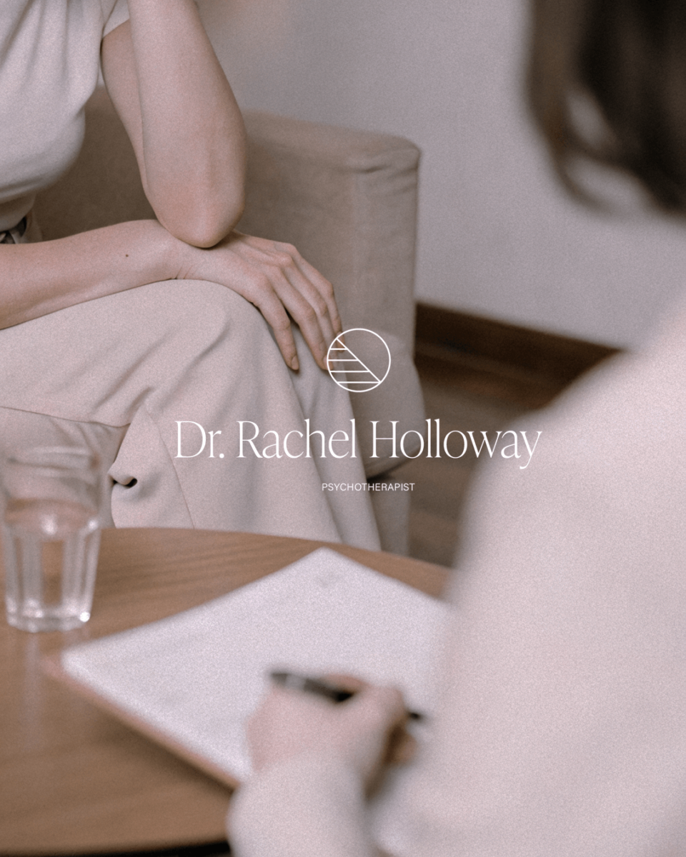
Dr. Rachel Holloway is a thoughtful and deeply empathetic psychotherapist whose approach is grounded in clarity, calm, and connection. When she reached out, she was in search of a logo that would mirror the emotional safety she offers her clients — a brand presence that felt serene, professional, and quietly reassuring.
Her vision was clear: something minimal, modern, and deeply intentional. A brand that wouldn’t speak loudly, but would instead invite trust through simplicity and grace. Together, we created a visual identity that embodies her essence — soft yet structured, refined yet approachable.
The final logo set is a visual metaphor for balance and introspection — a circular emblem that feels both grounded and open, paired with an elegant serif typeface to evoke professionalism and warmth. It’s a brand that doesn’t just present her work; it holds space for it.
The result is a cohesive identity that feels like an extension of Dr. Holloway herself — calm, clear, and comforting. A brand that lets her clients exhale before they even walk through the door.
Now it’s your turn
My mission is to refine your web presence with elegant minimalism.
I build digital projects around the idea of keeping things simple, clear, minimal and elegant. In this way, each project I humbly try to create captures the heart of what the client wants to communicate, with a touch of class that will never go out of style. And your project could embody these core values too.
